| |
Gothic and Symbolic Graphic FontsAlternative and creative. Site must be viewed at 1024 X 1168 resolution.
Today this font is still enjoyed by calligraphers, used with highly decorative illumination in extremely stylistic posters, invitations, and Christian religious materials, especially more expensive bibles.
A musical subculture, named Goth, also find blackletter fonts fascinating, as an introspective reminder of creativity and individuality, before machination forced itself upon mankind.
| |
 Alchemists were a type of metalurgist/magician during the dark ages whose purpose in life was to explore and find a solution to one particular question -- how to synthesize gold. The alchemist specialized in mixing all types of infernal ingrediants with one aim, namely to create the most valueable metal, gold, from worthless, everyday ingredients. Of course this work had to be kept strictly confidential and so alchemists had their own secret alphabet. This font is based on the alchemist alphabet made to resemble the English alphabet.
|
|
| |
|
|
|
 Astro This is a pictorial font and depicts the symbols assigned to astrological signs and celestial bodies. Beginning directly below the word Astro, in our image are the astrological signs in the following order:
• Aries The Ram. This symbol is easier to recognize than many because it actually resembles a ram's horns.
• Taurus The Bull. This symbol resembles a bull's head and horns.
• Gemini The Twins. Two lines joined together represents Gemini's symbol -- the twins.
• Cancer The Crab. Some consider Cancer's glyph as representing breasts, demonstrating the nurturing quality of Cancer.
• Leo The Lion. Leo's glyph may represent the two valves of the heart, since Leo rules the heart; alternatively, it can be considered the mane of the lion.
• Virgo The Virgin. This symbol is similar to that of Scorpio, except instead of the tail pointing outward, it curls up into itself.
• Libra The Scales. This glyph can represent the setting sun, or scales for weighing.
• Scorpio The Scorpion. This symbol is similar to that of Virgo, except that its "tail" points outward.
• Sagittarius The Archer. A simple-to-remember symbol that resembles an arrow.
• Capricorn The Goat. Perhaps the most odd-looking of the group, this glyph can be thought of as the twisted horns of a goat.
• Aquarius The Water Bearer. This symbol resembles waves in the ocean, making it easy to associate with the Aquarian Water Bearer.
• Pisces The Fish. This glyph represents two fish, joined together.
• The list finishes up with the RX symbol, and representations for celestial bodies in the following order: Sun, Moon, Mercury, Venus, Mars, Earth, Jupiter, Saturn Neptune, Uranus, Pluto. On the bottom line the last two symbols represent male and female.
|
|
| |
|
|
|
 Lombardic is a black letter or Gothic script or Old English script. This was the style of alphabet used in handwriting throughout Europe in the Middle Ages and we now call it calligraphy. While black letter hands were mainly used for formal writing, another style called bâtard or bastarde (below) grew out of everyday cursive writing and became a standard book hand by the middle of the 15th century. Black letter features uniform vertical strokes that end on the baseline, angular lines instead of smooth curves and circles, and the overlapping of convex forms. Black letter and roman were the dominant letter shapes of medieval typography. It is believed that the introduction of printing from movable type in the middle of the 15th century marked the death of calligraphy. Obviously, hand-written books could not be produced as fast or in as great quantity as printed ones, but the art hardly disappeared - it only changed direction. Printing also served to spread and standardize calligraphy. Calligraphy continued to exist but more as a curiosity than as an art form.
|
|
| |
|
|
|
 Bastarde shown here, is basically the hand used by the general public, who were literate, during the centuries before and within the gothic period. Many people were illiterate, because education was only available to the wealthy and highly appointed, such as nobility and the clergy. This script is very formal, drawn with a hand cut nib of wood or feather. The writing tools force the art of literacy, at this time, to be highly disciplined, to maintain a standard of legibility. Individualism was most likely unheard of and learning to write took much painstaking effort. This leisure time was not available to the general masses who had to work back breaking hours to survive. If you study the lower case letters in the two middle rows, you can recognize where today's cursive handwriting had its origins.
|
|
| |
|
|
|
 
The Gutenberg Press takes mankind
from blackletter to enlightenment
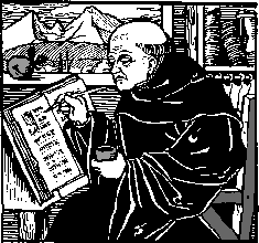
In the 1470s an Italian bishop explained that three printers working for three months could produce 300 copies of a book. He estimated that it would have taken three scribes a lifetime each to complete the same number, using laborious hand penned blackletter scripts, such as the two above.
The printing trade was well established even before Gutenberg's time, using woodblock technology. A sheet of paper was placed on the inked woodblock and an impression taken by rubbing - a complex and time-consuming procedure.
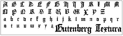
The first gothic font - obviously still a written font - was called Textura because of it's dark and barely legible typeface similar to a carpet. Originated in France in the 13th century, it spread rapidly to Germany, France, England, the Netherlands, Spain and Bohemia, where quite all Latin books were written in this typeface.
A soothed form of Textura developed in Italy and soon became important in Southern Europe during the 15th century: the Rotunda typeface. Characteristic for this typeface are the rectangular ends of slopes, the simple curves and the angular lines.
 Sometime around 1438 AD, Gutenberg was working on a plan to break out of the current methods of printing text of books using wood blocks. He set about carving individual letters, and developing a method to cast single letters in single pieces that varied in width but were precisely the same height. They then built precision molds for casting the letters in lead. These letters were positioned in a "chase" which aligned and blocked the type on a modified grape press which would become the first printing press.
The Gutenberg press with its wooden and later metal movable type printing brought down the price of printed materials and made such materials available for the masses. It remained the standard until the 20th century. The Gutenberg printing press developed from the technology of the screw-type wine presses of the Rhine Valley. It was there in 1440 that Johannes Gutenberg created his printing press, a hand press, in which ink was rolled over the raised surfaces of moveable hand-set block letters held within a wooden form and the form was then pressed against a sheet of paper.
Johannes Gutenberg is also accredited with printing the world's first book using movable type, the 42-line (the number of lines per page) Gutenberg Bible. Copies were illustrated in various places by the buyers of the book.
When Gutenberg invented his letterpress, he tried to imitate the gothic fonts in order to be able to compete with the beautiful handwritings of his time. Thus, Textura but also Rotunda and Bastarda typefaces can be found in printed books of that time.
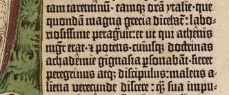 Compare the
Guttenburg bible (left) with the textura typeface below. Click for expanded view. Compare the
Guttenburg bible (left) with the textura typeface below. Click for expanded view.
This method of printing can be credited not only for a revolution in the production of books, but also for fostering rapid development in the sciences, arts and religion through the transmission of texts.
Illustration and decoration in printed books generally was achieved by the use of woodcut blocks that could be locked into the forme together with the type and printed in the same
process.
Though woodcut blocks, and the prints made from them, had commonly circulated before the invention of printing, it was the use of such blocks in printing that created a huge demand for the services of woodcutters.
Nicholas Jenson, a French engraver, settled in Italy working as an artisan in the early printing establishments here. His true distaste for Gutenberg's "Gothic Textura" lettering inspired him to begin developing his own style of lettering. He worked from the preferred Roman style letter that was more open and round, merging it with characteristics of Rotunda lettering. Jenson is attributed with developing the first pure Roman typeface. This new style showed little contrast between thick stem and thin hairline strokes because of the primitive carving methods of the times. His serifs were blunt and heavily bracketed; caps were shorter in height than the ascenders so that more lines could fit on a page. The lowercase "e" had a distinctive slanted cross stroke Jenson's Cloister Oldstyle became the first Old Style type face.
The famous roman type cut in Venice by Nicolas Jenson, and used in 1470 for his printing of the tract, De Evangelica Praeparatione, Eusebius, has usually been declared the seminal and definitive representative of a class of types known as Venetian Old Style. The Jenson type is thought to have been the primary model for types that immediately followed.
Old style faces are sub-divided into Venetian and Aldine or Garalde. Examples of old style typefaces include Jenson (Venetian), Garamond, Bembo, Goudy Old Style, and Palatino (all Aldine or Garalde).
|
|
| |
|
|
|
 Visitation This is a modern interpretation of the Gothic style. Note the tiny serifs on the letters and also that this font has used small caps for it's lower case. It's a very wide font and doesn't have much kearning space between the letters. This is a very specialized font and would probably only be used in relation to subjects that are gothic in nature. The modern day Gothic music movement would find this font very desirable, in titles.
 |
|
| |
|
|
|
 The Greek Alphabet Some names of Greek letters are known to us in the general public, without us even knowing what the words really represent. For example, here are the names of some greek letters: Alpha, Beta, Delta, Epsilon, Omega, Kappa, Phi. The Ancient Greek alphabet bears some resemblance to the Modern English Alphabet. The incorporation of Greek and Roman letters to represent English was done intentionally around the time the Guttenburg Press was invented, to better adopt to Gutenberg's printing technology. The problem at that time was, however, that ancient Romans had only uppercase, capital letters. Thus the font designers at that time dipped into the ancient Greek alphabet as well to provide inspiration for lower case letters.
|
|
| |
|
|
| |
|
|
|
 Nosferatu A slightly gothic typeface with an unconventional look and feel, this typeface takes its name from the movie of the same name. In the hands of director F.W. Murnau the film becomes a multidimensional and personal work that diverts from the original. This appropriation by Murnau explains why the title of the film is Nosferatu and not Dracula: Stoker’s widow saw the plagiarism of her husband’s work and brought court action against the production. Though she obtained the destruction of the film negatives, fortunately some copies survived this cinematic persecution. This font is, of course, good for anything goth: vampire inspired, Dracula inspired, netherworld topics and underground material. At the time of this writing, this font is one of the most downloaded on the web.
|
|
|
[top of page] |
|
|