| |
Serif Graphic FontsAlternative and creative. Site must be viewed at 1024 X 1168 resolution.
If you look at our first example below, you will see the serifs very well demonstrated. The areas where vertical and horizontal lines meet are softened with a curve. The ends of strokes do not end, but are capped.
The caplines and baselines would make it easier to carve the type plates which would have been extremely important at the time when typesetting was just being invented.
| |
|
|
| |
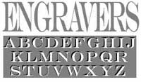 Engravers This is a beautiful serif font, available only in capitals or uppercase, and based on the alphabet of Roman antiquity. This font demonstrates the beauty of serifs on each of its letters. The serifs lend balance, flow, and help to round the letters and also connect them. The font also presents broad strokes combined with fine strokes which the serifs help to conterpoint. This type of lettering would typically be used carved on monuments or on engraved plates, thus its name, Engravers. This font lends class any where it is used and most appropriately should be used where antiquity and acadamia are important, such as: for banks, politics, museums, accounting firms, and lawyers.
|
|
| |
|
|
|
 SF Gothican The serifs on this font are not gracefully rounded. They appear to be there only because they must. This serif font presents more like a sanserif font, and thus is revolutionary. The strokes on the letters are all of the same width. If most sanserif fonts can be described as penned with a feathered quill, this one can be described as penned with a ballpoint. This font presents as intellectual, but rushed, without the care of prethought or as if it is the product of thought itself and not being copied down after the fact. This was the trend in times of old, to compose something and then do it in good. This font seems to be one that could be used for composing in good, and loose the intermediary stage. That would therefore, make this a very creative font. This font would bridge renaissance into gothic.
|
|
| |
|
|
|
 Times New Roman This is the most common font in use today in North America and Europe, believe it or not. For decades and still today, this is the accepted type set for books. If you don't believe me, pull out a few paperbacks or even hard cover books and look. This is the default font which appears in HTML and MS Word, if you do not designate a different font face. We are still stuck in the days of Times New Roman. This font, they say, reads well in magazines, newspapers and all the presses are set with this face. Why change something that works? If you want to appear faceless, devoid of personality, regular, stero-typical, this is the font to use. We chose not to use it on our site. Nuf Said?
|
|
| |
|
|
|
 The University Roman font is based on Speedball hand-lettering. Designed at the Letraset Type Studio in 1983, University Roman is notable for its narrow capitals with crossbars that sit well above the median line. This unique roman design evokes a romantic air in display work such as packaging and advertising. A popular typeface that has been widely used since its introduction by Letraset in 1972. This new and improved version includes many free-flowing swash alternatives that give designers more freedom for experimentation. Produced by Phillip Kelly in the Letraset Type Studio based on his and Mike Daines' original design. The beautiful, elegant Roman style features some unique characteristics. Its graceful, feminine qualities make it popular for a variety of applications, particularly greeting cards. The Italic style features an array of stunning swash alternatives and is an ideal choice for work requiring an elegant, feminine appearance. The Italic style was created in the Letraset Type Studio by accomplished designer Freda Sack.
|
|
| |
|
|
|
 Rockwell This font was created by Norman Rockwell, the magazine illustrator. The 1930s and 1940s are generally considered to be the most fruitful decades of Rockwell's career. Rockwell's illustrations reflected small-town American life. He produced work for such magazines as Life, Literary Digest, and Country Gentleman. In 1916, the 22-year-old Rockwell painted his first cover for The Saturday Evening Post, the magazine considered by Rockwell to be the "greatest show window in America." Over the next 47 years, another 321 Rockwell covers would appear on the cover of the Post. Rockwell's signature font was always included somewhere in his work. This font will give your site a down home feeling and is excellent for anything concerning middle America especially farming and agricultural endeavours.
|
|
| |
|
|
|
 Giambattista Bodoni (1740-1813) was called the King of Printers; he was a prolific type designer, a masterful engraver of punches and the most widely admired printer of his time. His books and typefaces were created during the 45 years he was the director of the fine press and publishing house of the Duke of Parma in Italy. He produced the best of what are known as "modern" style types, basing them on the finest writing of his time. Modern types represented the ultimate typographic development of the late eighteenth and early nineteenth centuries. They have characteristics quite different from the types that preceded them; such as extreme vertical stress, fine hairlines contrasted by bold main strokes, and very subtle, almost non-existent bracketing of sharply defined hairline serifs. Bodoni saw this style as beautiful and harmonious-the natural result of writing done with a well-cut pen, and the look was fashionable and admired. When used with care, the Bodoni types are both romantic and elegant, with a presence that adds tasteful sparkle to headlines and advertising. The Bodoni font distinguishes itself through the strength of its characters and embodies the rational thinking of the Enlightenment. The new typefaces displaced the Old Face and Transitional styles and was the most popular typeface until the mid-19th century. Bodoni’s influence on typography was dominant until the end of the 19th century and, even today, inspires new creations. Working with this font requires care, as the strong emphasis of the vertical strokes and the marked contrast between the fine and thick lines lessens Bodoni’s legibility, and the font is therefore better in larger print with generous spacing.
|
|
|
 Oswald Bruce Cooper (1921) designed Cooper Black, an extra bold roman face, based on the forms of his earlier typeface Cooper Old Style, which appeared with Barnhart Brothers Spindler Type Founders in Chicago. Cooper Black was produced by Barnhart in 1922 and acquired in 1924 by the Schriftguß AG in Dresden, where it was later completed with a matching italic. Although Cooper Black font appeared in the first third of the 20th century, it still looks comtemporary and it can be found on storefronts in almost any city scene. The flowing outer contours create forms that are both strong and soft, making Cooper Black an extremely flexible font. Cooper Black’s serifs are rounded and the counters are small. The capital O and Q of the Cooper Black font are tilted back; in the lowercase, the dot on the I and j become elliptical. The extra bold Cooper Black font has a remarkable personality and reproduces well in sizes over 18 point in titles, subheadings and generally short sentences.
|
|
| |
|
|
|
[top of page] |
|
|