| |
Narrow Graphic FontsAlternative and creative. Site must be viewed at 1024 X 1168 resolution.
BUT, some fonts are designed to be narrow, fitting well into tight spaces. They are useful if your company name is really long or if you want to emphasize the vertical rather than the horizontal plane.
We see narrow fonts being used by: a basketball team, a tall clothing shop, the CN Tower or the Space Needle, a fashion site emphasizing tall, willowy, and graceful clothing, or in diagrams with confined space.
| |
|
|
| |
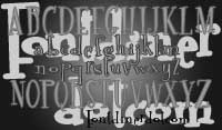 Font Diner.com is a font sharing web site and Font Diner is their own copyrighted font. This is a really fun font, whimsical and cartoonish. It is a serif font with an uneven baseline for the letters. This font doesn't seem to understand the concept of a circle, with most of it's letters being composed of ovals. This is how it maintains it's narrowness and actually gives it the interesting look that it has. Combined with it's stockiness in the vertical strokes as compared with the thinner horizontal strokes. This font would suit a site aimed at high school or college students, and any site that is fun and generous.
|
|
| |
|
|
|
 Jungle Juice is again a serif font with an uneven baseline which utilizes angles to give it its distinctive look. It has a haphazard, scribbled appearance with some letters being heavier on one side or the other, having no true form to the design. It appears handwritten and artistic, so it can be useful for less formal websites. This font might be appealing for a restaurant website, a hand-made jewellry site, a pet shop site, a comic book site, a candy store site and anyone trying to be trendy in a conservative way.
|
|
| |
|
|
|
 Aurora is a beautiful, simple looking, superbly curved, sans serif font that incorporates taller than usual lowercase letters. It is very futuristic looking and lends itself to flowing as in our image. You will note that we said simple looking. This font is not at all simple. The negative spaces usually found in a font are in the case of the Aurora font, not spaces at all, but lines. This is the peculiarity that makes it narrow. It has a very art deco feeling and would be a good font for any site that wants to be classic and modern at the same time. For instance: a book store site, a furniture or lighting store site, a fashion design site, a classy bar, restaurant or theatre.
|
|
| |
|
|
|
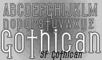 Gothican is one of the fonts of choice for the trendiest of music and art movements called Goth. It has tiny serifs and features taller than normal lowercase letters. It's design is based on ovals rather than circles and is very upright and disciplined, while taking liberties with its letter cross bars. It is very elegant and modern even though it relies on its gothic predecessors for its style. This font has fun in the most unexpected ways while still remaining cohesive in its design. If you are designing a goth fashion, music or artistic site, this is definitely one of your font choices. This font would also work for a medieval site or anything having to do with vampires, Dracula or other netherworld concepts. This font is not highly recommended for normal, day to day sites.
|
|
| |
|
|
|
 Willow is again, another art deco looking font, very simple and distinguished looking, with slight flourishes on some of the letters and the smallest of serifs to give it its style. It harkens to the arts and crafts movement, whose purpose was to strip down the extravagance of the Victorian era in order to mentor and usher in a more modern and simple style. In this day and age, it is quite graceful looking. When it was created it was probably most barbaric, as all revolutionary ideas are. This font would work well for a book store site, a restaurant site, anything high fashion, a flower or gift shop site, a chocolate site, a fine arts and crafts furniture site, or an interior design site.
|
|
| |
|
|
|
 Playbill is a very stylized font that comes to us from the "old west". With its very heavy, chunky serifs giving it a very solid appearance, the first settlers of North America relied on its sturdiness to deliver news of the post office's "Most Wanted" or to be notified of Can Can Girl performances. This font is great for anything having to do with stage coaches and cowboys, the old west, colonial times, and the early railroad. A gun company might use this font to its advantage, playing psychologically on the minds of viewers, harkening back to the day.
|
|
| |
|
|
|
[top of page] |
|
|