| |
Handwritten Graphic FontsAlternative and creative. Site must be viewed at 1024 X 1168 resolution.
or handwriting become defined as distinct from print. If print was the impersonal product of a machine, then script became the creation of the hand, physically and conceptually linked to the one who produces it.
If the mundane fact that people write by hand had never meant anything before, it was because in a world with no other way of generating writing, there had been no need to think about it.
| |
|
|
| |
 The lower case of the Amazone font most resembles the classic primary school board handwriting which we in North America are taught as children. The uppercase of Amazone contains subdued florishes which are the defining factor of a script. Scripts lend themselves to wave, flag and ribbon actions which can only be achieved in the computer with a painting application. This font would be terrific for a funeral home site, a dating site, a religious site and any site which seeks to teach or guide a socialogically repressed audience.
|
|
| |
|
|
|
 Edwardian Script is a very graceful script with a lot of florishes on its uppercase letters. This script would have taken much painstaking time to learn. Historically, lower class people did not write, but only printed because they had to work constantly to eek out their survival, leaving no time for higher learning. If one knew how to write in this manner, that person was wealthy and had plenty of time to learn. This font reeks of wealth and would elevate a jewellery site, a high class hotel, a very expensive restaurant site, or a lawyer's site to regal proportions. This script's uppercase letters are gorgeous for illuminating in the manner that biblical pages were illuminated in the time of the gothic monks.
|
|
| |
|
|
|
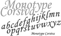 Monotype Corsiva starts to close the gap between printing, writing and script. It is a very curvaceous print font with serifs and small florishes on the letters. It is very high class in appearance but in a stark kind of way. This font lends itself to wave, flag and ribbon actions very well, looking willowy and windbound. It is to the script world what a model is to the high fashion world and it would look fantastic on a high fashion site. This font will work on sites that cater to women such as spas, beauticians and any site that promises to pamper a woman.
|
|
| |
|
|
|
 The Kaufmann font has a "left handed writing" look to it. It is very upright with well formed letters that lack the indifference of age and experience. The writer appears to take care in shaping the letters properly, but still allowing some personality through. The handwriting appears youthful and determined. This font would suit a Community College site, a job site which caters to young people in the work force, and would work well for Valentine's Day greetings.
|
|
| |
|
|
|
 The Mistral font has the appearance of relaxed everyday modern handwriting that has a bit of a shorthand twist to it, as if the writer is in a hurry, perhaps taking notes in a university class or jotting down details of a hurried shopping list or schedule. This font tends to lean toward the artistic as it is very economical with a caligraphic feeling to the uppercase letters. This font would work well for a restaurant site which caters to college aged adults, a savvy art college site, an art gallery site, a design site, a coffee house site, and a book store site.
|
|
| |
|
|
|
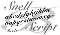 Snell has the appearance of handwriting done with a chisel cut quill pen. The uppercase letters have economical florishes. It is a kind of poorman's Edwardian script. It definitely has a feeling of respectibility and learning, but appears to be learned from a more militarilistic basis rather than from noble standing. This font denotes learning of an academic and government type. This font would work well on a historical site, a not quite as ritzy restaurant site or a university site.
|
|
| |
|
|
|
[top of page] |
|
|