| |
Graphic Fonts Created With PhotoshopAlternative and creative. Site must be viewed at 1024 X 1168 resolution.
Many graphic Artists enjoy creating fonts. Working through internet sites called Font Foundries, graphic artists will present their font creations for public use as shareware, which can be downloaded freely.
We have devoted an entire section of the elle A Design website to fonts because we think that Font consideration is that important because your lettering and graphics can drive your point home.
Magazine publishers love to have fonts designed exclusively for their own use. With the advent of movies and television came font designs done exclusively for certain programs and movies. Brady Bunch and Jurassic Park come to mind. This section presents a mix of old and new fonts, giving some ideas of how best to utilize them, where to use them and the type of fonts best suited to various types of websites. Welcome to the world of fonts and enjoy.
Adobe Photoshop is a wonderful application program which utilizes fonts to create graphics. In this application font properties can be adjusted in some of the following ways:
Size can be adjusted.
Space between letters (kerning) can be adjusted.
Colour can be changed and varied.
Outlines can be applied.
Gradient, texture and 3-D treatments can be applied.
Groups of letters can be made into shapes such as flags, ribbons, arches, fish and many more.
Filters can be applied to create phenomenal effects.
As a result, one single font can be adjusted in a myriad of ways giving you a ton of different looks and combinations. You can make your title lettering reflect the purpose and goal of your website. For instance, ABC Renovation Company can use an arch function on their company name and using brick and wood textures, make their company name look like an arched window, reflecting what they do. Any texture which can be photographed can be incorporated into Photoshop and used as a texture brush. Imagine the possibilities! Below is more information about writing systems and the development of our modern English written language.
|
| |
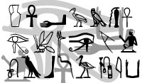 The earliest known systems of writing have been named petraglyphs and hieroglyphs. Between 3000 AD and 1000 AD the ancient Egyptians developed a very detailed hieroglyphic language which represented literal sounds and also symbolic religious concepts. Their depictions became highly formalized and scribing of the language was done by priests. Egyptians covered their walls, buildings and columns with hieroglyphic scripts, which were either painted or carved in relief. The scripts usually dealt with the declaration of epic events and worship of their king. The Egyptian king was believed to be the earthly incarnation of God and thus when the Egyptians wrote anything it was for religious purposes. Depicted above are some of the highly stylized Egyptian hieroglyphs which, when used in tandem with architectural design produced breathtaking results.
|
|
| |
|
|
|
 The ancient Persians developed a written language which we today call Cuneiform. The symbols were stamped into clay tablets using a variety of different shaped tools or painted into frescos. Depicted at left is an example of some Persian Cuneiform letters.
|
|
| |
|
|
|
 Some names of Greek letters are known to us in the general public, without us even knowing what the words really represent. For example, here are the names of some greek letters: Alpha, Beta, Delta, Epsilon, Omega, Kappa, Phi. The Ancient Greek alphabet bears some resemblance to the Modern English Alphabet. The incorporation of Greek and Roman letters to represent English was done intentionally around the time the Guttenburg Press was invented, to better adopt to Gutenberg's printing technology. The problem at that time was, however, that ancient Romans had only uppercase, capital letters. Thus the font designers at that time dipped into the ancient Greek alphabet as well to provide inspiration for lower case letters.
|
|
| |
|
|
|
 The 15th century witnessed probably the most drastic revolution in typeface design. During centuries prior to that time, the prevalent style of letterforms was the one now called blackletter, or "Old English" seen at left. Complex, whimsical blackletter shapes were difficult to write and read; what's worse, they were absolutely clashing with the ideology of the then-burgeoning Renaissance movement and its admiration of classic Roman and Greek art. New, humanist writings required creating a new type of fonts - more secular, more legible, and more elegant.
|
|
| |
|
|
|
 Due to its origin, this new font type was then named Antiqua, i.e. "Ancient." (Later, the term Antiqua was used for all typefaces that appeared after the blackletter era, and the original Antiqua fonts came to be named "Old Style" or "Humanist Antiqua.") Ironically, it is these first Antiqua exemplars (more precisely, their 20th century replicas) that have probably the most up-to-date and fashionable look for the modern eye. Enough to name such fonts as Garamond, Minion, Jenson; their light, spruce, stylish outline conveys the unfalsifiably humanist spirit, and these fonts are now very popular for all sorts of design jobs.
|
|
| |
|
|
|
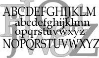
 Overall the most peculiar (or at least, peculiar to a modern look) Antiqua features were ironed out with time---by the end of 17th century, a new type of font design was emerging. This new type design, belonging to the 18th century, is now called Transitional because of its intermediate position between the Old Style and Modern styles. Here belong such faces as the ubiquitous Times Roman and Baskerville; their features include higher level of contrast (vertical strokes are noticeably thicker than the horizontal ones), mostly vertical stress (the "O" is symmetric, although lowercase letters, such as "e" in Times, may still have diagonal stress), and a more linear, austere design. Serifs in these fonts are not too long, sometimes pointed, and connected to main strokes through outspoken coves (so the serifs seem to have a triangular shape). The appearance of these fonts for modern perception is almost ideally neutral. The shapes and proportions of letters, the relative prominence of strokes and serifs, the contrast level---all these features are nearly transparent for the eye, adding minimum, if any, distinctive or "personal" features to a font. In short, transitional design could be a good candidate for a "generic serif font."
Times New Roman, depicted below, is the most widely used of all Transitional fonts---and probably even of all existing fonts.
Overall the most peculiar (or at least, peculiar to a modern look) Antiqua features were ironed out with time---by the end of 17th century, a new type of font design was emerging. This new type design, belonging to the 18th century, is now called Transitional because of its intermediate position between the Old Style and Modern styles. Here belong such faces as the ubiquitous Times Roman and Baskerville; their features include higher level of contrast (vertical strokes are noticeably thicker than the horizontal ones), mostly vertical stress (the "O" is symmetric, although lowercase letters, such as "e" in Times, may still have diagonal stress), and a more linear, austere design. Serifs in these fonts are not too long, sometimes pointed, and connected to main strokes through outspoken coves (so the serifs seem to have a triangular shape). The appearance of these fonts for modern perception is almost ideally neutral. The shapes and proportions of letters, the relative prominence of strokes and serifs, the contrast level---all these features are nearly transparent for the eye, adding minimum, if any, distinctive or "personal" features to a font. In short, transitional design could be a good candidate for a "generic serif font."
Times New Roman, depicted below, is the most widely used of all Transitional fonts---and probably even of all existing fonts.

|
|
| |
|
|
|
[top of page] |
|
|