| |
Emotive Graphic FontsAlternative and creative. Site must be viewed at 1024 X 1168 resolution.
A good rule of thumb is to use variations of the same font throughout your site in a design scheme. It is important to match the look of the font to the purpose of the site.
For instance a government web site would not want to use the font Jokerman or perhaps any of the fonts on this page, but a children's or teen web site might.
| |
|
|
| |
 Beatsville is an interesting font combining the typical curves found in the modern English alphabet with not so typical squares and angles in the inner negative areas of the letters. It has a balanced, well rounded appearence giving the font a generous feeling of space. This font is on the edge, where conservative meets playfulness. It is appropriate for a site where the publisher wants to appear hip but still wants to tone down to appeal to a less liberal, peripheral audience.
|
|
| |
|
|
| |
 This font, Sprite, is a gorgeous Art Deco or Art Nouveau font, probably designed around the turn of the 20th Century. A number of movements changed the way people thought about design, architecture and art at that time. Women began to want recognition as human beings, to be considered more than just the possesions of men, and to own and vote in their own right. This was a very revolutionary time for women and the focus was on the ladies. Art and fashion delved into making women the beauties that they were. Hemlines began to rise, clothing was more constructed and form fitting, corsets were eradicated, fabric was silky and diaphonous. This font reflects the times and is still fresh and fashionable.
|
|
| |
|
|
|
 The shape and spacing of the Pookie font is very reminiscent of the Courier font, which was the first font built into typewriters, back in the day. Another interesting fact about typewriters is that the QWERTY keyboard was designed in the manner that it was, to stop the typewriter arms from striking each other and becoming stuck. Thus the spacing of the keys was ordered so that the most commonly used letters were interspersed within the least commonly used letters. In our times now, the QWERTY keyboard is still in use, for all the wrong reasons. There is probably a much better way to order the keys. And in the same vein of thinking, the Pookie font is the Courier font, resurrected into a modern rendition of a classic, resembling a type written page. This is a very serious font and somewhat revolutionary, as it brings into question the validity of keeping dinosaur concepts, such as the QWERTY keyboard around.
|
|
| |
|
|
|
 Remember the punch label machine with it's rotating disk that let you select the letter, and the sqeeze action mechanism that was built in to it, to press out the letters. Wasn't it fun to use this gizmo and put labels on everything we owned?! This would be a fun font to use in a menu, and the labels would be affixed to drawers, folders or containers of some sort. We also see this font as useful for the creation of a map. Available only in uppercase letters, but coloration is anything in the rainbow.
|
|
| |
|
|
|
 Fruity Drink is a very imaginative name for a font. The font itself looks as if it is painted with a roller and brush on a rough textured wall. It incorporates no curves at all and has only uppercase letters. It is very angular and gives a feeling of being put down in haste. This font leans more toward the radical and artistic, with still a youthful feeling to it. It would work well on a music related site, an artistic site or a site that is edgey, trendy and very liberal.
|
|
| |
|
|
|
 Broadway is a font that was created early in the twentieth century around the advent of electricity. It is an art deco font. This font works very well when its dimensions are manipulated. It works well as it appears here, squat and round. It also works well stretched. This font is appropriate for any site having to do with film or theatre. It would work well for a sophisticated steak house restaurant, especially in a theatre district or on a site having to do with deco art.
|
|
| |
|
|
|
 Continuum Bold is a very clean, smart looking, unadorned font, very angular but with it's angles curved it almost looks like neon tube lettering. It feels as if it should be conducting light into a very modern and high tech website. It is a futuristic font, in which all extraneous strokes and curves have been stripped away to look as if it was created to be machine language. Even the font's name gives the impression of a bridging of the present into the future. This font would work well on a high tech web site, a modern furniture web site or an electronics website.
|
|
| |
|
|
|
 Cramps is an artistic font which again looks like it has been spray painted onto a rough textured wall. It appears to be very commonplace North American printing, available in uppercase only and taught in all elementary schools. But this font is not suitable for children. It is a radical font and relates to alternative purposes such as music, cultural offshoots of such music groups, aristic endeavours and sites which deliver underground and startling messages.
|
|
| |
|
|
| |
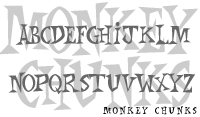 Monkey Chunks sounds and looks like words you might find poured onto a chocolate bar. It is a highly sculpted and exagerated font, available in upper case only with a very commanding, masculine appearance which at the same time is whimsical and posterlike. It would work well on a candy site, a comic book site, a children's site or an educational site having to do with animals. This font would look great in red and green stripe, used for christmas greetings.
|
|
| |
|
|
| |
 Matisse was a noted turn of the 20th century, impressionistic painter who studied Japanese block prints and developed his style from these studies. This font has an oriental flavour as if painted with a chinese calligraphy brush. The font is only available in uppercase and becomes difficult to read if used in a block of text. This font exudes artistic panache and would work well for artistic sites, very modern restaurants, perhaps a book store or gift shop. In spite of its simple appearance, it is a very adult font and I would not recommend it for a child's site.
|
|
| |
|
|
| |
 Jokerman is one of the most whimsical fonts available. Even presented in tones of gray, one can imagine it being very colourful and decorative. It has a tropical, carribean feeling to it exuding a carnival, festival and good-time feeling. And it is totally not to be taken seriously. This can be both a children's or an adult font as long as the subject is fun, light, musical and sunny. Highly recommended for anything Carribean, tropical, spicy.
|
|
| |
|
|
|
[top of page] |
|
|